
4. Toolbarsadd chapter
4.1 Toolbar Configurationadd section
In the Toolbars tab toolbar configurations for the BCS-2 Express, Office and Professional can be created and exported or imported.
The toolbar configurations can be selected by the user in the BCS-2 Office and Professional applications via the drop-down list below the job list.
A toolbar configuration can consist of several toolbar elements that are combined according to their function. The position of an element within the configuration can be determined by the administrator, whereby the user has the possibility to move individual elements, unless this is explicitly forbidden.
 The toolbar configurations should always be adjusted to the workflow or user, so that only functions are made available that are really needed. By the order of the request the workflows can be clarified to the user additionally again with the help of the icons.
4.1 Toolbar Configurationadd section
In order to simplify the creation of the toolbar configuration, it makes sense to paint the rough layout on paper beforehand. Where should the view, navigation, postprocessing etc. be positioned? Only when the rough layout is ready should a new configuration be created.
Using the buttons in the Toolbar Configuration area, new configurations can be created, existing ones duplicated or Toolbar configurations imported and exported.
Using the drop-down list on the left, existing Toolbar configurations can be selected for further editing, testing or exporting.
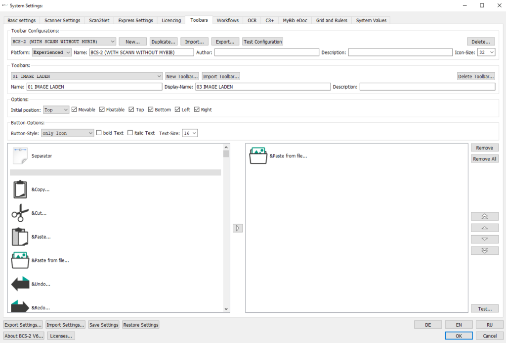
Click the New button to create a new toolbar configuration for BCS-2. The name of a configuration must always be unique so that it can be found at any time. For special adaptations, a description of the toolbar should also be stored.
The platform (Express, Office, Professional) for which the toolbar configuration is intended can be specified for each toolbar configuration. By selecting the platform, BCS-2 checks during the toolbar creation that no functions or icons are added to a toolbar that are not available for the corresponding product.
The layout of the toolbar configuration can be displayed via the button Test configuration. In the new window here the position and contents of the toolbar elements and the size of the icons can be checked.
Icon size: The size of the icons can be selected via the dropdown list. The size should always be selected depending on the user, screen and the number of surface icons.
4.3 Create Toolbar Elementadd section
In the Toolbars area, the toolbar elements for the respective configuration are created.
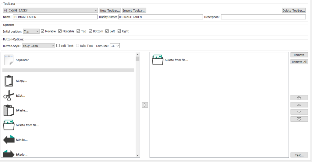
In the dropdown list the already created elements can be selected to check, correct or delete them. After selecting or creating a toolbar element, the name as well as the set options and icons for the toolbar are displayed.
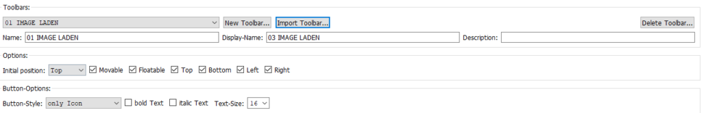
The New Toolbar button can be used to create a new toolbar element. The name of the toolbar should be unique in order to simplify testing and transfer to other toolbar configurations.
Toolbar elements can also be imported from other configurations; the Import Toolbar button opens the dialog for selecting a toolbar from an existing toolbar configuration.
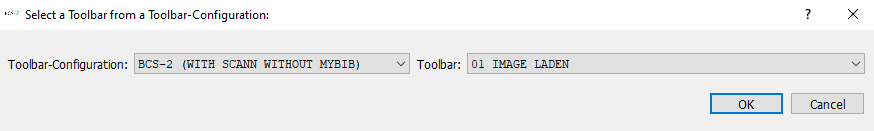
The corresponding elements can be selected via the dropdown lists Toolbar Configuration and Toolbar and transferred to the new toolbar with OK.
4.4 Toolbar Optionsadd section
The following settings can be stored for each toolbar element in addition to the name and description.
4.4.1 Options
Initial position (Top, Bottom, Left, Right): The dropdown list is used to select the initial position of the element. This determines where the toolbar element is displayed at the beginning of the application.
If and where a toolbar can be moved by the user is determined by setting the corresponding checkboxes, the following options are available:
Moveable: The user can change the position of the toolbar.
Freely positionable: The toolbar can be placed anywhere, even in the viewer.
Top/Bottom/Right/Left: The toolbar can be set up top/bottom/right/left
Buttons Options
In the Options buttons you can select how the buttons are to be displayed on the surface. The buttons are available for selection:
- Icon only
- Text only
- Text next to icon
- Text under Icon
- The font size and type (bold/italic) can also be set.
Icons
For each toolbar element, the corresponding icons are selected from the icon list on the left and added to the toolbar.
To add an icon to the toolbar, select the icon in the list and either use the arrow button in the middle or double click on the toolbar icon.
The order of the icons can be changed using the arrow keys to the right of the toolbar window.
To remove an icon from the toolbar, select it in the right window and click the Delete button.
To visually separate functions or functional units within a toolbar from one another, separators can be inserted into the toolbar.
Layout and the selected button options can be checked with the Test… button.